skip to main |
skip to sidebar
WONDER WOMAN: BOLD NEW LOOK? I DON'T THINK SO!
 I saw in the news today that WONDER WOMAN is getting a "bold new look" in WONDER WOMAN #600, which is available today. You can read the article and see the new WONDER WOMAN costume that is, "designed to be taken seriously as a warrior", by clicking here. What an ugly design. The colors look awful, too. I like super heroes that are colorful and fun! How many times have we seen this type of "new and improved" move flop? This is one of the many reasons why I can't stand modern-day "comic books". Publishers think moves like this will improve slumping sales. How about hiring writers who write stories that are actually fun to read and entertaining, and hiring artists who can actually draw characters that have appealing designs? Just like they used to during the 1940s through the 1970s. There are reasons why the popularity of comic book heroes lasted so long during those years...reasons that have been long dismissed by today's publishers.
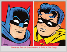
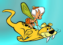
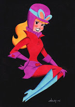
The top image is the 1960s WONDER WOMAN Aurora model box front...and the bottom image is my 5x7 WONDER WOMAN original art that is based on the original 1973 SUPER FRIENDS design by ALEX TOTH. BOTH represent the WONDER WOMAN that I think most people prefer.


 I saw in the news today that WONDER WOMAN is getting a "bold new look" in WONDER WOMAN #600, which is available today. You can read the article and see the new WONDER WOMAN costume that is, "designed to be taken seriously as a warrior", by clicking here. What an ugly design. The colors look awful, too. I like super heroes that are colorful and fun! How many times have we seen this type of "new and improved" move flop? This is one of the many reasons why I can't stand modern-day "comic books". Publishers think moves like this will improve slumping sales. How about hiring writers who write stories that are actually fun to read and entertaining, and hiring artists who can actually draw characters that have appealing designs? Just like they used to during the 1940s through the 1970s. There are reasons why the popularity of comic book heroes lasted so long during those years...reasons that have been long dismissed by today's publishers.


.jpg)

.jpg)


2 comments:
gee, that looks very...ANIME! how trendy...
ooh, word verification- "hydra"!
Ohhhh Dear! They have made her look like a social worker, that is reeeally bad!
You can see this "Brave new direction" lasting all of five minutes!
P.S loving your version masses more Patrick thats how I remember seeing her on Superfriends!
Post a Comment